
Impact/effort matrix
Prioritisation tools for designers - Part 1


I get to have the best conversations :) This week, I was asked about which prioritisation tool to use in a different scenarios.
Of course the answer is.. It Depends.
And so you lot get another article.
Actually I’m going to do it as a mini-series on Prioritisation tools because in our discussion I found some new uses for methods I’ve been using for years that I hadn’t considered.
To follow along, if you haven’t already, you might want to subscribe. I’m also going to release a FigJam workshop kit for paid subscribers.
Five types of prioritisation tools
Whether you are prioritising product features, backlog fixes, ideas from an innovation workshop, or your team’s to-do list it’s useful to have a few different tools in your toolbox.
Because when it comes to choosing the right kind of prioritisation method well…
It Depends.
Method 1 - Impact/effort matrix
Many peoples’ go-to or the mental default when people think about prioritising a backlog of items or actions is the Impact/Effort matrix.
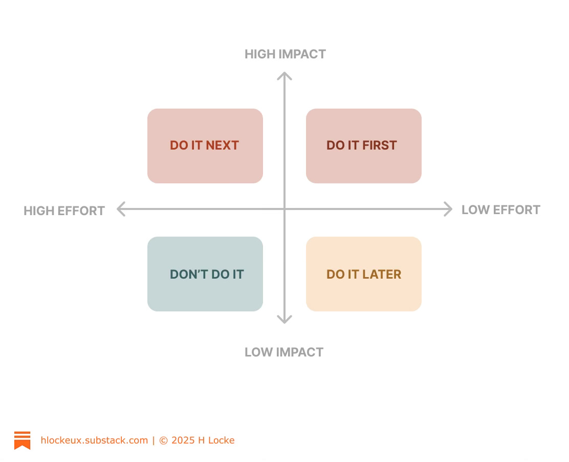
This method is used to categorise items based on their probable value (impact) and the effort involved in implementing them.
Usually via a workshop discussion with multiple stakeholders, each item is discussed and positioned in the matrix.
Note - although the designer can do some work upfront on the business case or impact of items, in the area of effort, multiple stakeholders are needed who have a view of (for example) the effort of technical implementation.
Once items are placed, it is usual to then prioritise as follows:
DO IT FIRST - to be done immediately - upper right - High value, low effort. Or as one sometimes rather dangerously says, ‘quick wins’.
DO IT NEXT - to be done next - upper left - high value, high effort. Painful, but worth it
DO IT LATER - to be done last (often just parked by stakeholders) - low value, low effort. You could do them easily enough but why bother, so probably no one ever will
DON’T DO IT - avoid and never ever do - low value, high effort. Otherwise known as, the road to nowhere.
Pro’s and con’s
This framework is easy to use, because it doesn’t require calculations.
However that also means it can be done on instinct (guess work) unless someone - I’m looking at you Service Designers - has done some background work to size the prize, or size the effort by working with various cross-functional teams to understand what would be involved.
Nevertheless it’s visual, it’s simple, it works well in workshops because participants understand it easily, can have lively discussion, and can leave the task believing that something has been achieved because there are clear ‘winners’ in the items that you’ve prioritised.
You can also run it with almost any set of items, and any set of stakeholders.
The biggest part of the work for most people is making the list live beyond the workshop, as people focus on delivering the quick wins, and then something else becomes more shouty and higher priority before the next level of priorities gets addressed.
But such is design life.