


Is it ok to ‘grey out’ disabled buttons?
Accessibility, inactive buttons and WCAG

Accessibility, inactive buttons and WCAG.

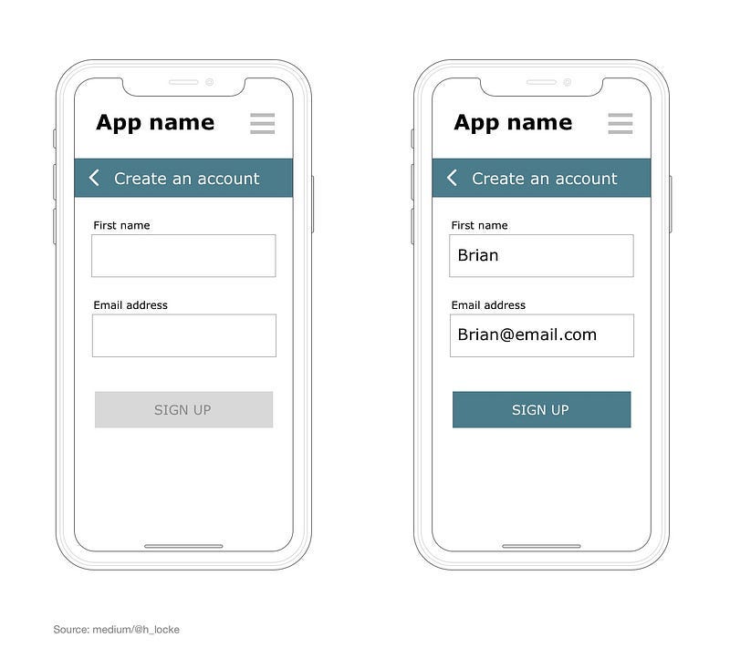
Disabled or inactive buttons are often “greyed out” — with white or grey text on a grey button. These can be used to communicate to the user that some kind of task needs to be completed by them before they can proceed, such as entering an email address in a text field prior to sign up.
But how accessible is this?
This is such an accepted design pattern, that for some reason I’d never questioned it, until I was raging about colour contrast (I do that) and realised that a grey on grey, faded out quasi-invisible CTA (call-to-action) has to be one of the worst infringements of WCAG guidelines.. surely?
What’s the official answer?
Well according to WCAG, disabled buttons don’t have to adhere to AA colour contrast requirements.

Wait, wut?
Let’s take a closer look at this…
1.4.3 Contrast (Minimum): The visual presentation of text and images of text has a contrast ratio of at least 4.5:1, except for the following:
Large Text: Large-scale text and images of large-scale text have a contrast ratio of at least 3:1;
Incidental: Text or images of text that are part of an inactive user interface component, that are pure decoration, that are not visible to anyone, or that are part of a picture that contains significant other visual content, have no contrast requirement.
Logotypes: Text that is part of a logo or brand name has no contrast requirement.
So if a disabled button qualifies as an “inactive user interface component”, which technically it does, then we don’t have to make it accessible?
I can see how they got to this — there are lots of random, inactive, branding or creatively-led bits of UI detritus on most interfaces, but this can’t possibly include.. a button that lots of humans can see and understand, but some can’t.
On the one hand, this is a UI element that is unavailable to everyone, however it is still visible to some users and definitely not pure decoration.
There has to be more we can do
I don’t know about you, but to me it feels like just ‘meeting’ the top level WCAG requirements isn’t enough.
So, assuming that having a “greyed out” button meets the criteria, what else can we do to support users by exceeding it?
It’s desire path time.
Here are a list of other things we can do to improve the accessibility of our disabled buttons. I’m not saying all of these will work, but they are things to investigate, try and of course test (with humans and/or with software).

Ensure colour is not the only affordance. As another part of WCAG says, you must not communicate something only using its colour, so just being grey isn’t enough. Consider other visual ways to distinguish active and inactive/disabled buttons. Remember you can view your designs with a range of sims to see how this is going as you design.

Upweight other colours so that your grey is not stupidly pale. If you already have a dark grey primary CTA (well, it could happen) don’t make your disabled one quasi-invisible grey, change your primary instead.

Reduce opacity, not hue saturation. This is an interesting one. Rather than go grey, use an opaque version of your primary CTA colour. This communicates what it will be, rather than that it is a dead thing cluttering up your UI. Doesn’t do a lot for pure colour contrast, but maybe it’s not requiring the user to learn another type of button style.
Put it next to (or in the visual vicinty of) enabled buttons. Not always possible, but consider how you are going to build the user’s mental model as part of your CTA strategy — is the disabled button the first time they see any button in your UI? How can you add appropriate friction into the experience so that they see active ones first, and therefore have a chance of knowing this is a less interactive version?

Add supporting text. Not sure about this one, but could we use supporting text near or underneath the disabled CTA that disappears once the desired task has been achieved? (text shown as example for emphasis, not recommendation)
Ensure font sizes don’t change. On all buttons, whether enabled or disabled, don’t do anything funky to size or weighting of text, like making the font smaller on disabled buttons.
Enforce application of the 3:1 ratio required for all other interface components, even if technically we don’t have to. This will incur extra visual design effort as a higher contrast grey button will compete with the rest of our palette. But that’s our problem to solve.
Support screen readers. Apparently we can do this by using
aria-disabled=truerather thandisabledwhich lets the user know that there is actually a button present, andaria-liveto prevent accidental submission of an incomplete form. Brilliant guide on both of those available here. And check out this video on the difference to the user experience of usingaria-disabled=trueacross different browsers and screenreaders.Use “cursor disabled” on desktops on hover state.

The alternative to all of this of course is just to have a single primary CTA style, but that generates additional “error state” information on press. However, it feels like disabled buttons are so ingrained as a design pattern that this would feel weird to both designers and users. Not to say it won’t be where we end up.
Is this really a problem with WCAG?
Well, apparently some clever people are paying attention to this. I’ve found some great Git discussions about this issue, and there appears to be an excitingly named group called Silver Task Force (which I imagine to be like Space Force, but you know — useful).
It seems they will be tackling this among many other issues post-WCAG 2.1 and will be coming back with recommendations next year. In the meantime,
However, that’s still another 18 months of potentially inaccessible CTAs littering the internet, so in the meantime let’s keep trying to design for the actual users of our products combining WCAG guidelines with as much additional testing and learning as we can, and make efforts to ensure that as many people as possible can understand and use our interfaces.
Please note: the above is my current understanding from reading the internet and talking to humans. However the world is full of people who are wrong. Always get a proper accessibility consultant to assess your work.