Links vs. buttons
How you know you’re looking at a marketing website
How you know you’re looking at a marketing website
There’s a discussion I’ve seen a few times on social media recently. When it comes to CTAs (Calls-to-Action), it seems many of us are doing it wrong.
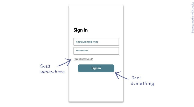
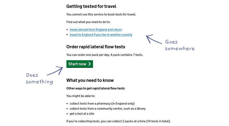
According to good old best practice, underline links and solid state buttons communicate two different things: a button says that you are going to change the state of the website (either front or back end), whereas a link is going to take you somewhere else (and doesn’t change the state of the website). In short a button does something a link goes somewhere.
A button does something; a link goes somewhere.
So what’s the problem?
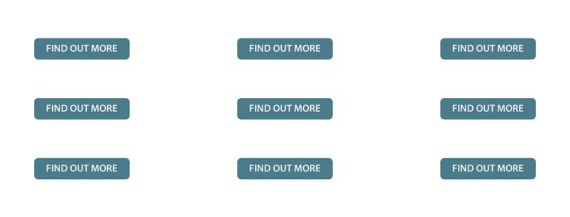
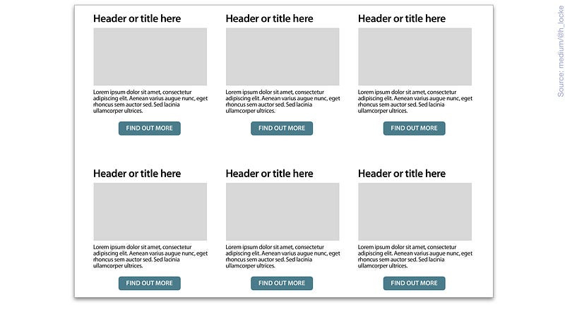
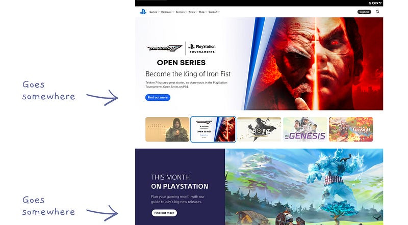
Anyone who has designed a website for a paying client, has probably failed to use the above rule in every case, or been under pressure to use solid state buttons throughout. It ends up looking like this:
Not only does this not correctly differentiate a button vs. a link (state change vs. journey), but it’s visually overwhelming.
(and yes, I know “find out more” is the lamest CTA copy of all time. It’s an illustration).
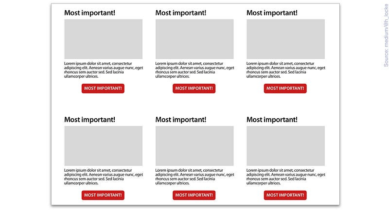
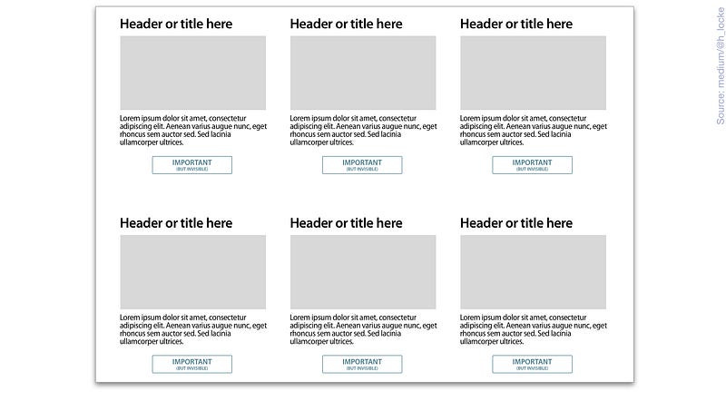
In this design, you’re basically saying this to the user:
This is because you’re using what is a primary CTA… everywhere.
This is adding significantly to cognitive load and as as we know, if we overwhelm the human brain it tends to panic and run away.
And accessibility..
Most dreadful UI decisions that impact best practice usually also have a negative impact on accessibility. Failing to design the correct link or button for your interaction in the UI means it will most likely be carried through to dev. Here’s a great example on Twitter of why this is risky:
The impact of marketing-centred design
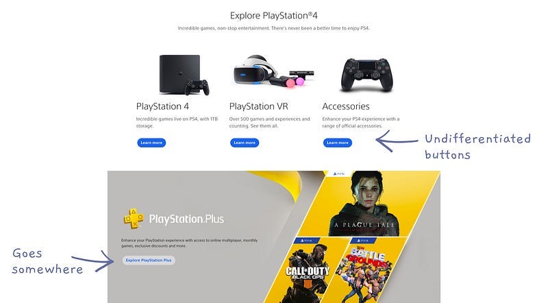
You see this kind of button-spam UI all the time in marketing websites. Here is an example from the Playstation website:
Whereas you definitely wouldn’t see this on GOV.UK, which uses the recommended CTA differentiation based on purpose of interaction.
Why is this? Well, think about not only the user, but the client and business objectives.
In the case of the UK government, the emphasis is definitely on what is right for users, because users are taxpayers. And if taxpayers cannot use services they’ve paid for, they tend to kick off, which means that politicians kick off, and no one wants to be told off publicly in the House of Commons because their website/service doesn’t meet standards.
Also, the UK has the Government Digital Service (GDS), a team of hardy UX and service designers and leaders who have set standards and design/accessibility frameworks for all UK government services. They are not going to mix up the CTAs, because they have a solid design system that (hopefully) prevents it, and are seemingly empowered to enforce its usage.
Now let’s compare with Playstation.com — the user here is someone we want to consume brand content until they are ready to buy something (note the actual purchase happens elsewhere).
This is the top of the funnel, and the top of the funnel is the shiny attractive marketing bit. The client therefore is the marketing department. And their number one objective is making something that a) looks good b) is on brand and c) shoves people down the sales funnel.
So websites tend to become a series of sales messages, one after the other:
Module 1 — “here is a product you can buy”
Module 2— “here are some products you can buy”
Module 3— “here is a product you can buy”
and so on…
In short, they want as many <I AM IMPORTANT — PRESS ME> buttons as possible. In my experience, the motivation for doing this is to demonstrate to internal stakeholders that they’ve done everything they can to… shove people down the sales and marketing funnel.
Unfortunately, this is symptomatic of many marketing teams. Unless someone empowers or forces marketing leaders to make experiences usable and accessible, unfortunately we’re always going to end up with button spam.
Where is this going?
There are several ways this could go in future. Here are the main three that come to mind:
Users will recognise button spam websites for what they are and avoid them, much like one would avoid a site covered in ad banners today
Design patterns could change over time in terms of user familiarity rather than being successfully designed in line with cognitive processes. This is the case with the hamburger menu for example.
We’ll end up no longer really adhering to design patterns at all
In the case of the latter, we can look forward to a world where users kind of expect anything, or that they have to work each website out for themselves.
In this world, buttons can do anything and links can do anything. We’re already half-way there on many websites where marketing-centred or designer-centred work is in evidence. One classic example of this is websites where ghost buttons are your only CTA UI style throughout your product instead of a secondary treatment (shame on you).
What can we do to fix this?
This is not to say that, as with all good UX, there is not a fight to be had before we give in to button spam websites and other nonsense. Here are some strategies to fight back against the tide of “whack a button on everything”:
Push for best practice at the beginning — even if your work gets gradually eroded through the design process, maybe you’ll have a few less buttons and a couple of links left at the end
Create a logical CTA strategy with a clear next best action — present the logic to the client and demonstrate how the most important CTAs (i.e. purchase the thing) are given more prominence in the hierarchy
Wield data —Having many similar buttons can be harder to track in analytics as you are distributing traffic across multiple journeys rather than creating one strong funnel. It is easier for clients to show ROI if there is one clear sales path through a site
Point out the spam — tell clients they are going to look like a marketing website, which can impact user trust and drive up bounce rates
Use the accessibility stick — most clients, and most humans respond to fear of being sued, or fear of being perceived to be an ahole. Here are some tips on approaching from that angle
Stay on top of trends — just in case something dreadful becomes industry standard. You never know when the latest style of CTA will become the next hamburger menu
Do what’s right for users anyway — at least design it right the first time, take your shot at getting client buy in, and worse case scenario — you can put something good in your portfolio. Hiring managers know that lots of your work won’t go live (sorry).
Sometimes, the best we can do is fight the good fight — insist on best practice in our design work, demonstrate via user testing that it is the right solution (and if not, iterate).
And if you’re not allowed to test or a client absolutely insists on button spam — give them your professional advice, a clear view of the implications on brand perception and then move on to a more deserving project.
Resources:
UX movement — When to use a button or a link
UXIU — Buttons & links, the basics
A11y101 — Button vs link (html/css)
NNG — Ten usability heuristics


