

I always love to hear ‘strong opinions strongly held’ (1), and anyone who says that something is always, absolutely, categorically <thing> is going to inspire a rebuttal article.
This week, I am inspired by someone who thinks personas are made up users and we should never use them.
But, as we all know… it depends.
Why personas fail
Many junior designers I’ve worked with seem to think, or were taught that personas are a standard deliverable that should always be produced as part of the basic bootcamp style ‘design thinking’ process.
However, adhering to these kinds of ‘rules’ regarding any UX deliverables results in artefacts that are simply not used.
e.g. If an audience doesn’t know what they are for or how to use them once created, they will often become a tick box exercise which languishes in portfolios and adds no value to a project or its stakeholders.
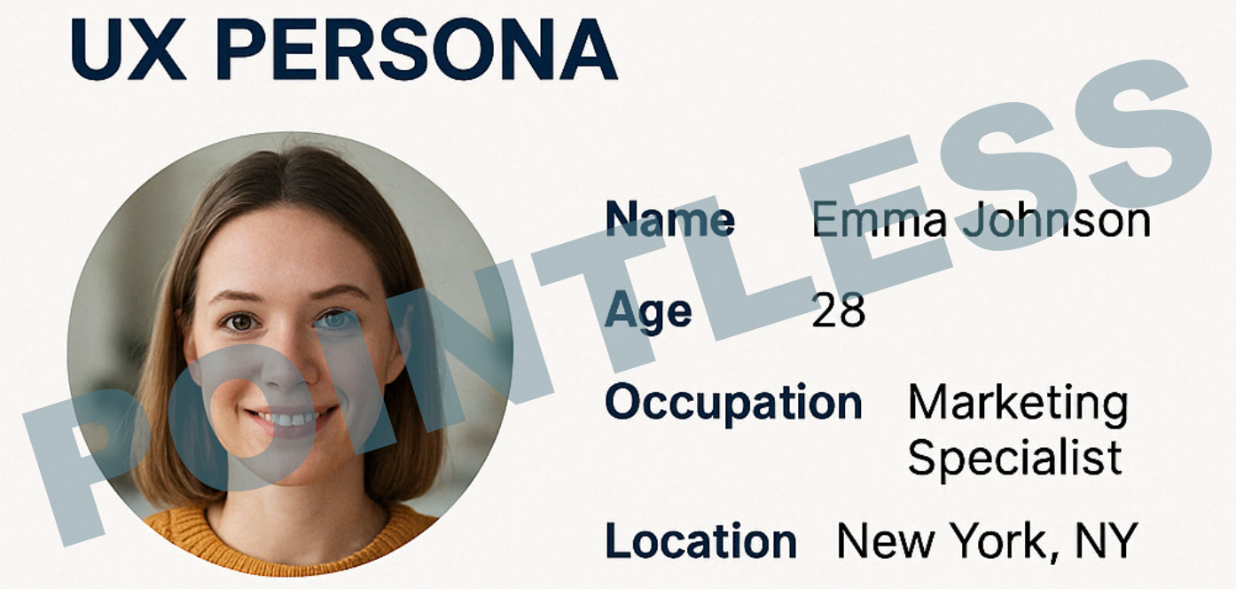
So yes, superficial personas that aren’t used and aren’t based on any decent level of insight and primary research are pointless.
And don’t get me started on the AI-generated versions… 😫
No wonder the internet is spawning ‘they are pointless’ articles - anything is pointless if you’re not doing it right.
Anything is pointless if you’re not doing it right
When they are useful
But here’s the flip side of this.
They can be useful, if executed correctly, and communicated well to stakeholders, and used strategically within teams.
The purpose of a persona (or pen portrait, or archetype) is to communicate some kind of needs or behavioural difference between your user or customer groups.
This means you have done some level of research and discovered something that separates Group A from Group B in terms of how they behave, and therefore what they need from your product or experience.
And you want to communicate that in some fashion to your stakeholders so that they can understand your design decisions, your strategy, or recognise them in your research reports.
You don’t have to make “a pretty”
You don’t have to create some stunning visual masterpiece. You only need to create something that communicates difference. And the fidelity of what you produce should reflect the fidelity and depth of your research.
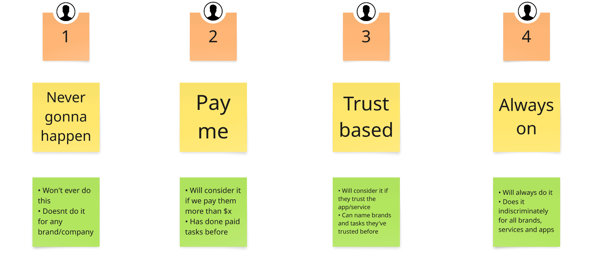
Example A - Mindsets and archetypes
When doing short projects, I have often found initial differences regarding how users think about a product or service. It’s early stage research but enough to start telling a story to stakeholders. Therefore, in whatever format I’m using - Miro, Powerpoint, whatever - I need to visualise some kind of difference. Therefore I would create a simple slide that shows side-by-side the basic characteristics and differences. If I’m feeling creative, I’ll give them a catchy name to communicate the most important thing.
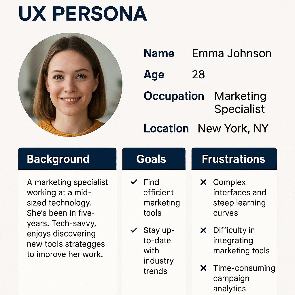
Example B - Pen Portrait or full persona
If a project continues beyond this point and/or I start to gather more data, I might create a small set of personas or pen portraits that bring the different behavioural groups to life but only because I have enough evidence to do so. I’m not going to this level by default because I rarely get this much data up front and so there would be gaps or a risk of makeyupy insertions.
Keep reading with a 7-day free trial
Subscribe to It Depends... to keep reading this post and get 7 days of free access to the full post archives.