Why we all need to be using colour contrast checkers
The most basic, easiest-to-fix thing in accessible digital design is the one thing designers keep forgetting about over and over…
I’m fairly confident (never assume) that I don’t need to explain why websites, apps and all digital tools should be accessible to all; it’s the right thing to do, and it’s the law.
And yet the most basic, easiest-to-fix thing in accessible web and digital design is the one thing designers keep forgetting about over and over and it drives me potty.
Why can’t we all just design with accessible colour contrasts?
What is an accessible colour contrast?
By accessible, I mean that the colour you are using and the background it is on should be a colour ratio of 4.5:1¹).
According to W3C colour contrast guidelines under WCAG 2.0 (which has been around since 2008 so we really have no excuse), that’s the difference in colour between text and the background behind the text.

I would also highly recommend considering this for text-to-button-to-background contrast ratios as well as I’ve often seen these contrasts fall down where you least expect it.
If you’re not sure, the easiest way to think about it is this — is this element that I am designing fundamental to the user’s understanding? I’d argue that if it’s a CTA you ever want someone to press, then yes.
Testing colour contrast
You can test the colour contrasts in your design yourself. You really have no excuse. And it’s kind of fun.
There are several tools available:
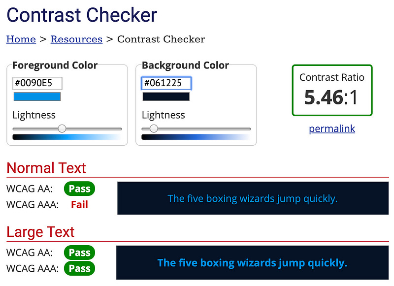
Web aim colour contrast checker— this is a simple web page where you input hex codes, hit a (highly accessible) button and voila! Pass or fail for AA or AAA. It also includes an assessment for Graphical Objects and User Interface Components.
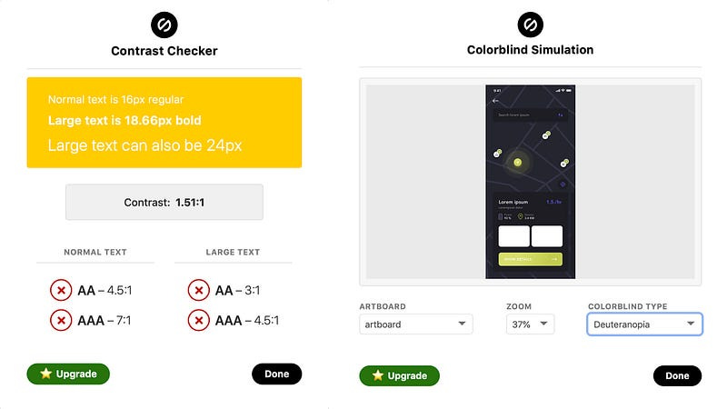
Sketch plugins — if you’re too lazy to open a browser, then there are a few different sketch plugins available. Here’s an example of the Stark plugin in action.
You’ll notice that it has both colour contrast and colour blindness simulations. And yes, colour blindness is another thing we need to be thinking about, with 1 in 12 men and 1 in 200 women experiencing some kind of level of colour blindness.
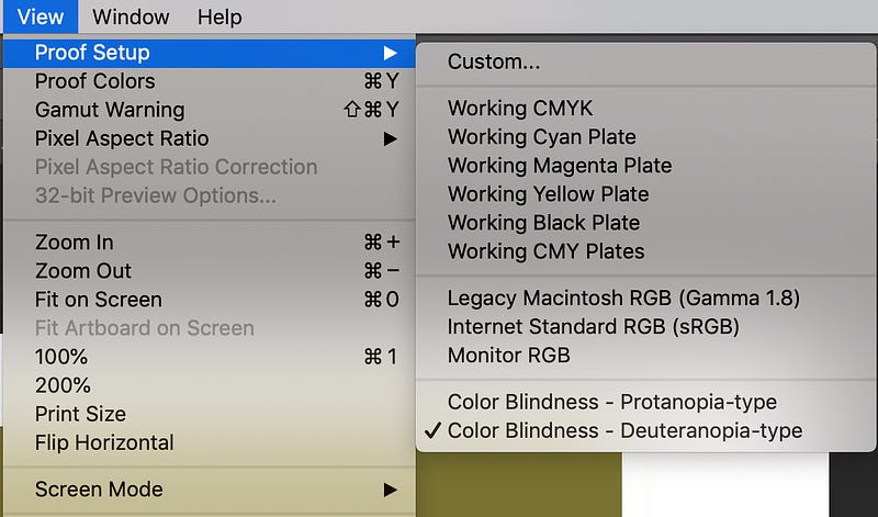
And if you’ve got any old school designers or devs who insist on using Photoshop… did you know that the tools for colour blindness are actually built in to the primary nav? Bet you didn’t.
We really do need to use the tools
The most interesting thing about colour contrast is that you really can’t detect it with the naked eye, even if you (think) you have perfect colour perception vision.
Yes, it’s easy to see that the white on yellow above should get someone fired, however there are lots of combinations that aren’t as easy to test with the naked eye alone. You could easily assume (never assume) that the palette you are working with is accessible because you can see it.
Newsflash: you are not the user.
Let me show you two examples from real projects I’ve worked on, where I was saved by the tools.
Case #1 — This is accessible
To my eye there was no way this was accessible. When I saw what the UI designer had selected, I had a mild heart attack. This was for a client who actually cared about meeting AA accessibility requirements (and not just in the “please don’t sue me” way).
So I fired up the Web Aim, and sure enough — everyone could breathe a sigh of relief.
Case #2— This is NOT accessible
Some years ago I was emailed some design work with the classic line “the client asks if this is accessible” (go client!).
Keep reading with a 7-day free trial
Subscribe to It Depends... to keep reading this post and get 7 days of free access to the full post archives.


